The colour gurus at Pantone have chosen a refreshingly bright and peachy hue of Orange for 2019. Pantone 16-1546 or ‘Living Coral’ is an “animating and life-affirming coral hue with a golden undertone, that energises and enlivens with a softer edge”. The colour will be a hot topic on this years cat walks for sure, but it also lends itself beautifully to weddings. Whether it's a base colour scheme or just an accent pop, here is everything you need to know about ‘Coral’ at your wedding.
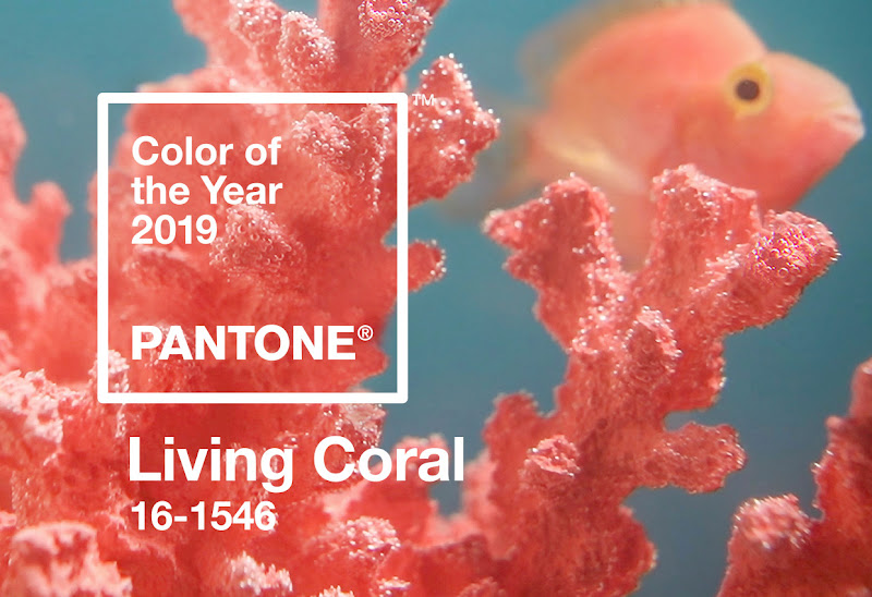
A distinct contrast to last years ‘Ultra Violet’ - a deep, statement shade of purple, this years colour reflects an “innate need for optimism and joyful pursuits”. Pantone go on to explain that the colour is a reaction to a natural desire to step away from your computer and “seek authentic and immersive experiences that enable connection and intimacy”. The colour also celebrates the nourishing impact of coral on sea life and its relevance in societies focus on caring for the environment. Pantone see this symbolic and societal reference as being ‘desired’, ‘familiar’ and ‘energising’. Psychologically the colour is calming, warm and promotes engagement. It’s calm but powerful hue not only makes a statement, but makes you smile.
It’s easy to see how the characteristics of this colour lends itself to a beautiful summer wedding. In our recent photo shoot with Elen Studio Photography, you can see how versatile the colour is and how it can be incorporated into your wedding.
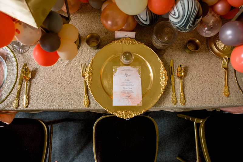
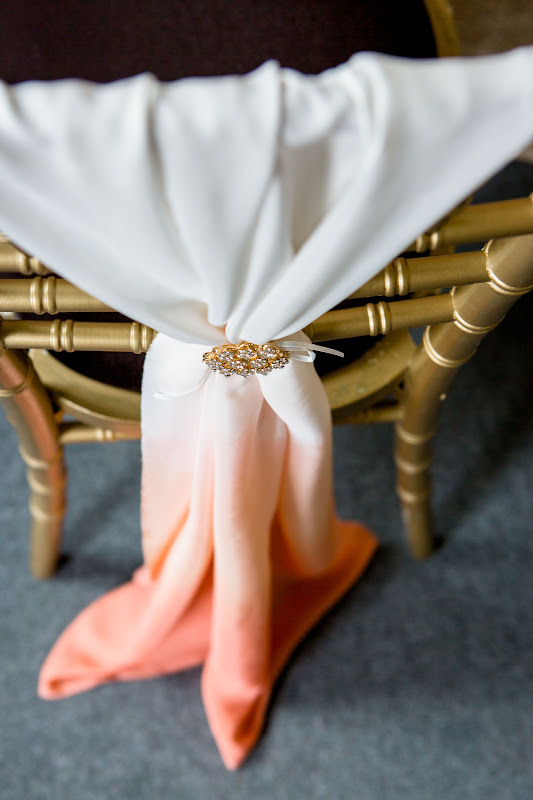
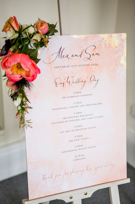
DylandCo who dressed the venue has done an amazing job incorporating the colour into the wedding aesthetic. The ombre silk on the back of the chairs is from ‘Laikstyle’. It is a perfect demonstration of how you can be really creative with colour, even in the simplest of ways. Notice how the colour sits back beautifully with the marble and gold, a luxurious yet fun material/ colour partnership. This look is all about the details, don’t be afraid to add texture. Themes and colours can really come together in unity on graphics and cards around the venue. I love what ‘With love wedding stationary” has achieved by bringing the colours and textures of this shoot together on the ceremony card.
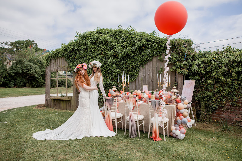
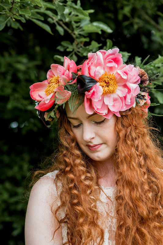
The styling also lends itself perfectly outdoors and can really give a boho-chic feel. The coral flowers used in this shoot really emphasise how natural the colour feels outdoors, accenting perfectly against the surrounding greenery.
The dresses for the shoot have been selected by Rosie at Mimi Toko
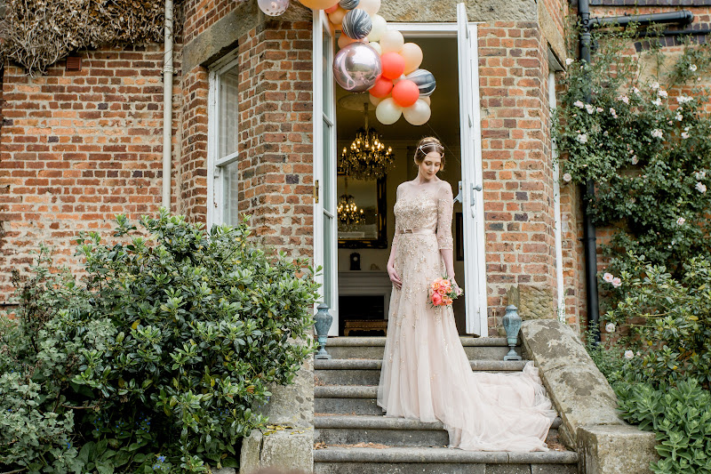
You can see how the colour, the detail in the beading and the fit just sits back perfectly with the rest of the shoot. The dresses are really eye catching and bring a real ‘Wow factor’.
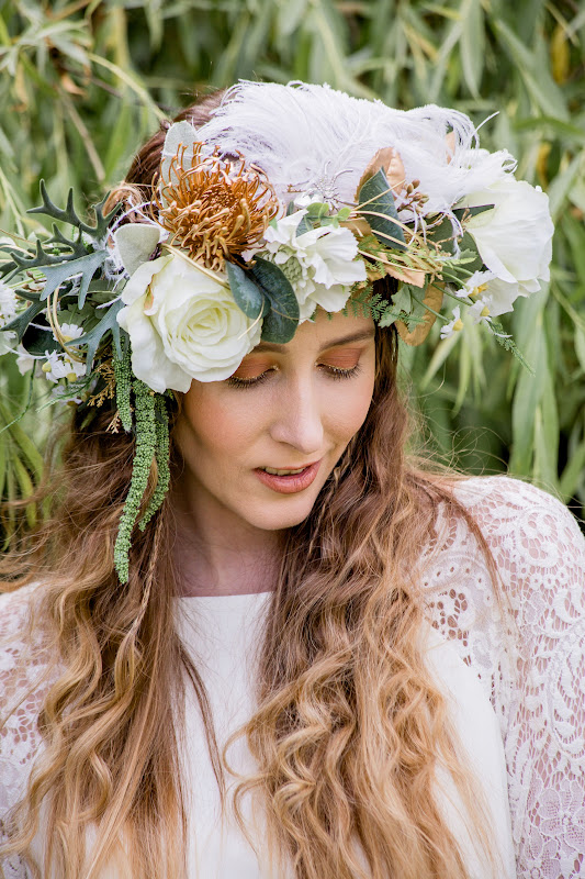
Mary-Ann from Thomasina Brides has really completed the look of the dress with her hand crafted accessories and vintage treasures. She has championed the gold pallet with nature inspired interest pieces, a real encapsulation of the essence of Boho-chic.
‘Living Coral’ looks great not only at your venue, but also in your makeup pallet. Speaking to Sophie Downing, our resident makeup expert, it’s clear to see why the colour is becoming so popular.
“The easiest way to incorporate coral into your pallet is to wear it on the lips, this suits most complexions.”
“The colour really allows you to perk up your skin, whether that is a warmer tan in the summer or a more radiant complexion in the winter. It leaves an undertone that isn’t too deep, but not to yellow either.”
We are of course all different, so it is important to understand how colour affects us in our own individual way, an important factor to bear in mind is of course your eye colour.
“Coral is a great colour for people with Green, Hazel and Brown eyes, especially incorporated with gold glimmer. Between them they add radiance to open the eyes and help pronounce the shape. Without the gold highlight, the coral alone might be too deep and set the eyes back.”
“People with blue eyes would be much better suited to a warmer colour, the pinky tones in coral can make blue eyes look sore.”
This is interesting to note, traditionally according to colour theory, blue would be a complimentary colour to Coral. When it comes to makeup however, they are both very striking and will end up competing for attention on your face.
The makeup sits back well with the hair, designed carefully by Annette Gray. The plaits, soft curls, crimps and waves really compliment the boho chic look of the shoot. These have been complimented by elaborate floral headdresses by Denise Harvey from Funky Florists.You can really see the coral colour carry through.
Whether it is the core theme at your wedding or just key makeup details, Shottle Hall have the expertise and experience to deliver even the newest of trends on your big day. Follow us on social media so you get the latest updates on what our team of experts are working on.
Like what you see? Go behind the scenes with us as we find out what it takes to make a shoot like this come to life.
Video by The Agnew Film Company